By William M. London
“The Quest for the Cures…Continues” is an eleven-episode video documentary series made available intermittently online at thetruthaboutcancer.com to promote dubious cancer treatments euphemistically labeled “alternative medicine.” The most recent “replay marathon” began November 27th and ran for five days.
In Part 1, I discussed the marketing of the documentary and the background of its host, Ty Bollinger.
In Part 2, I began my discussion of the 68-minute Episode 1. That episode has now been viewed more than 172,000 times on YouTube. I introduced the commentators interviewed in the video, provided a list of ten types of deceptive ploys that commentators make to shift viewers’ trust away from standard treatment methods and toward so-called “alternative” methods, discussed the activities of some of the commentators, and described details about the first three types of deceptive ploys: #1 the passionate personal ploy, #2 the doctors-don’t-know-about-nutrition ploy, and #3 the oncologists-wouldn’t-give-themselves-chemotherapy ploy.
In Part 3, I discussed two more deceptive ploys used in Episode 1: #4 the Hippocratic Oath ploy and #5 the allopathic medical monopoly ploy. I also discussed the weird, unimpressive qualifications of the two commentators who pitched ploy #5.
In Part 4, I discussed ploy #6: the medical industrial complex ploy, which blames the supposed suppression of supposed cures on vested interests of medical organizations and personnel. I also discussed the vested interests of the commentators who complained about the medical and cancer industrial complex.
I continue my critique with an in-depth examination of the cancer holocaust ploy as offered in Episode 1. I think the ploy deserves a close look since I have observed speakers at conferences for “alternative” healing and “health freedom” use it to blame modern oncology for high rates of developing deadly cancers.
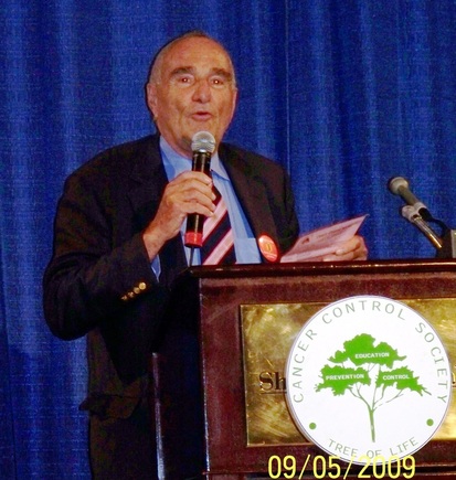 Burton Goldberg at the 2009 Cancer Control Society Convention. Photo credit: William M. London
 Ploy #7: The Cancer Holocaust Ploy
In Episode 1, Burton Goldberg is the main pitchman of the cancer holocaust ploy. Goldberg, who describes himself as being a businessman throughout his adult life, is introduced in the video and on his Web site as “the voice of alternative medicine.” He is indeed a prominent promoter of “alternative medicine” and his efforts have been good for business, if not consumers.
In 1994, the Burton Goldberg Group compiled Alternative Medicine: The Definitive Guide, which was published by Goldberg’s company Future Medicine Publishing, Inc. of Fife, Washington. I’ve seen copies of this well-known book or the 2002 revised edition on the shelves of many bookstores during my shopping trips over the last twenty years. The book is hard to miss since it’s more than 1,000 pages and well over two and a half inches thick. I happen to have my own copy, which I have used as a step stool on occasion. I don’t trust it for much else.
The cover of the book features a blurb by Deepak Chopra and provides this description: “30 Leading Edge Physicians explain their treatments.” Leading edge, of course, really means, in most cases, beyond-the-fringe physicians who promote treatments that lack plausibility and validation.
“The alternatives in this book are sound, based on science, and really work,” it claims on page XXXV. But the book is full of supposed alternatives that have no more soundness than Goldberg’s alarmist cancer holocaust ploy in Episode 1, which begins with dodgy statistics:
When my daddy was born in 1900, 1 in 33 Americans had cancer of any kind, shape, or form. When I was born in 1926, cancer was the tenth leading cause of death in children. Today it’s the first cause of death before accidents. What’s going on? There’s a holocaust. It’s not a question of ‘will I have cancer’? It’s a question of ‘When’?
It’s a very seductive message designed to undermine trust in standard methods of cancer treatment. I don’t think most consumers are likely to recognize why the message is misleading. There really has been a “cancer holocaust,” as I’ll explain, but its cause is neither mysterious nor unavoidable. The real “cancer holocaust” has no relevance to Goldberg’s advocacy for “alternative” cures for cancer.
There’s a great deal to unpack regarding Goldberg’s opening pitch. Please bear with me as I attempt to explain the insidious nature of the cancer holocaust ploy.
I’m not sure where Goldberg came up the 1 in 33 figure, which, given the phrasing of his first sentence would represent an estimate of prevalence (how common a condition is). I am unaware of any system that was in place in the U.S. in 1900 to provide cancer prevalence data. Even today, reports on cancer trends present incidence data, which tell us about people who are newly diagnosed with cancer, and mortality data, which tells about people dying of cancer.
So let’s see if I can help Goldberg provide some substance to his argument by considering real data on mortality.
In 1900, cancers were the eighth leading cause of death in the United States and accounted for one out of every 25 deaths. On average, for every 100,000 people in the U.S. population, 64 people died of cancer in 1900.
In 2011, cancers were the second leading cause of death in the United States and accounted for one out of every 4 deaths. On average, for every 100,000 people in the U.S. population, 185.1 people died of cancer in 2011.
Now, didn’t I just make the case for a cancer holocaust stronger than Goldberg did? Perhaps, but I did so by using accurate statistics presented with subtle statistical sleight-of-hand and misdirection. To explain, I need to discuss two important reasons for the increased importance of cancers as contributor to the burden of mortality.
The main reason that cancers are now a more important cause of death in the U.S. than they were in 1900 is that today a far greater proportion of the U.S. population is fortunate to live long enough to develop the types of cancer that cause the most deaths. You can’t die of cancer if you have already succumbed to other diseases or injuries.
In 1900, life expectancy at birth was less than 50 years; by 2009 it was over 78 years. In 1900, it was common for people to die young because there hadn’t yet been much public health progress in preventing deaths from infectious diseases, malnutrition, and injuries. The top seven leading causes of death were: (1) pneumonia & influenza, (2) tuberculosis, (3) diarrhea, enteritis, and ulceration of the intestines, (4) diseases of the heart, (5) intracranial lesions of vascular origin, (6) nephritis (inflammation of the kidneys), and (7) accidents.
Deadly cancers are diseases that develop predominantly among middle-aged and older adults. The American Cancer Society estimated that 585,720 Americans would die of cancer in 2014 with 1,960 of those deaths (0.3%) occurring in the 1 to 19-year age group. The types of cancer that often kill middle-aged and older adults are very different from the much less common cancers that are responsible for deaths of children and young adults.
The American Cancer Society’s report on “Cancer Statistics, 2014” contradicts Goldberg’s claim that cancer is the leading cause of death among children. Cancer is the leading cause of death among children through disease, but in the U.S. in 2010, for those who were 1 to 19 years of age, accidents (or unintentional injuries, in public health parlance) were the leading cause of death, taking the lives of more than 7,500 children. For young people (ages 1 to 19), cancers were the fourth leading cause of death among males and the second leading cause of death among females. Even in the 20 to 39-year age group, accidents were the leading cause of death while cancer was the fifth leading cause of death among males and the second leading cause of death among females.
In the U.S., the incidence rate for childhood cancers increased at an annual rate of 0.6% per year from 1975 to 2010. Although it isn’t clear what caused this slight increase, it is likely due to a combination of unidentified environmental influences, improved diagnostic efforts including increased use of magnetic resonance image, and increased access to medical care. But in the same period, death rates have declined by an average of 2.1% per year. This decline is attributable to improved treatment and supportive care. Trends in childhood cancer incidence and mortality do not suggest that there has been a “cancer holocaust.”
I don’t know whether Goldberg is correct about cancer being only the tenth leading cause of childhood cancer in 1926. I suspect he’s not far off. But that low ranking doesn’t mean that cancer rates have gotten dramatically worse. It reflects how major causes of death among children in 1926 are much less important today (largely due to improvements in sanitation and vaccination).
In the United States, cancers are now the second leading cause of death (behind heart disease) for the population overall instead of the eighth leading cause of death (as they were in 1900). The higher ranking of cancers as a cause of death today is due mainly to the greater progress made against other diseases and injuries that killed so many young people in 1900. Rankings for a disease category as a cause of death are affected by mortality trends for other diseases.
By analogy, a sports team can have the same won-loss record two years in a row, but the team’s ranking in league standings can be very different in those two years. Rankings are affected by what competitor teams do.
There has been clear progress in reducing death rates from all cancers combined, but the amount of progress has been disappointing compared to the dramatic progress we’ve seen in reducing heart disease death rates in the United States in recent decades.
Cancers are already the leading cause of death in the United States for people under age 85. If the trend of dramatic decline in heart disease death rates continues, cancers will eventually become the leading cause of death in the United States when all age groups are considered.
Moving up in rank as a cause of death doesn’t mean that the risk of dying of cancer is increasing. The mortality rates for cancer that I presented above for 1900 and 2011 are the correct crude (unadjusted) mortality rates. But it would be a mistake to argue that the numbers mean that from 1900 to 2011, there has been almost a tripling in the cancer mortality rate (from 64.0 per 100,000 to 185.1 per 100,000).
The problem is that the numbers are crude when they should be properly adjusted in order to avoid making an “apples to oranges” comparison. The necessary adjustment in this case must take into account how the population in 2011 includes a significantly larger proportion of older people at high risk for cancers than did the population in 1900.
In other words, comparing mortality rates for two very different time periods requires adjustment for age. Age-standardized rates rather than crude rates are needed to compare rates from populations from different places or times.
When I teach introductory epidemiology, I use an analogy to illustrate the importance of adjusting statistics in order to make fair comparisons. I ask students to consider changes over decades in the entry-level salary of public school teachers in the U.S. My students are surprised when I tell them the salary I was expecting when I was pursuing a public school teaching job in 1980. I wound up with a different kind of job that gave me an annual salary that was close to what I could have expected as a high school science teacher: $10,500. Contrast that with the average annual entry-level salary of public school teachers in 2007: $35,284.
Is it correct to say, based on these data, that entry-level public school teachers are paid more than three times better in 2007 than they were in 1980? It might look that way, but most of my students are savvy enough to realize that dollars in 1980 are not equivalent to dollars in 2007. In order to make an unbiased comparison between salaries in 1980 and 2007, it is necessary to adjust the salary figures for inflation.
The crude salary data, just like the crude cancer mortality data, simply aren’t appropriate for comparison. Age-standardization (age-adjustment) of mortality rates from different years is needed to make fair comparisons just as inflation-adjustment is needed for comparisons of salaries for different years.
Making comparisons using crude, non-standardized mortality rates is a misleading way of making the case that there has been a “cancer holocaust.” But it’s quite clear that there has been a very real, tragic “cancer holocaust” that has nothing to do with how effective standard or “alternative” cancer treatments are. The real cancer holocaust that we continue to face is due to cigarette smoking, the second most important reason for high rates of cancer mortality today.
According to the National Cancer Institute:
Lung cancer is the leading cause of cancer death among both men and women in the United States, and 90 percent of lung cancer deaths among men and approximately 80 percent of lung cancer deaths among women are due to smoking.
In November, a new analysis published in Annals of Epidemiology conservatively estimated that 28.7% of deaths from 12 types of cancer are attributable to cigarette smoking. That means that as many as 28.7% of cancer deaths can be prevented by eliminating exposure to cigarette smoke. That’s well over 100,000 deaths per year.
But Goldberg looks in the wrong places for the holocaust:
But Goldberg looks in the wrong places for the holocaust:
And the oncologists are keeping their mouths shut. They use chemo. They use radiation. And radiation causes cancer. Mammograms cause cancer. We know that. Medical researchers and medical journals prove it. Yet they still do it.
Chemotherapy and radiation therapy cause a very small percentage of all cancers. When properly used the benefits of these treatments greatly exceed their risks of causing cancer. The low doses of radiation from mammography do not significantly increase risk for cancer. The most significant risk of mammography used to screen for hidden breast cancer is overdiagnosis leading to unnecessary treatment.
Goldberg advocates instead for bogus alternatives:
Goldberg advocates instead for bogus alternatives:
Whereas thermography and ultrasound can be very beneficial without the violent side effects of annual mammograms and squeezing the breast. Guess what happens if there’s a tumor there. You’re squeezing it through the body. It’s insanity.
But there simply isn’t evidence to support the use of thermography for breast cancer screening or diagnosis. Ultrasound is no substitute for mammography, but it does have some uses in evaluating the breast problems found through mammography or physical examination. The claim that mammography squeezes cancer through the body is without foundation. Same for breast fondling, by the way. Violent side effects of mammograms? Bruising and short-lived discomfort are not unusual. That’s about it.
Goldberg completes the cancer holocaust ploy by blaming organized medicine:
Goldberg completes the cancer holocaust ploy by blaming organized medicine:
So the medical profession in my opinion is as corrupt as any third-world nation. And this country is allowing it. And the reason it’s allowing it is because subsequent to the Roosevelt administration, the agencies that were designed to protect humanity are protecting the industries they’re supposed to protect us from.”
Quite a convoluted path taken by Goldberg to blame a supposed cancer holocaust on the corruption of the medical profession! I’m reminded of a favorite quotation of epidemiologists attributed to Michael Gregg: “We are always dealing with dirty data. The trick is to do it with a clean mind.” It seems to me that it’s difficult to keep one’s mind clean when it’s filled with paranoid conspiracy theories.
If Goldberg really cares about government agencies protecting humanity, why is he an advocate for “health freedom,” the notion that people offering medical treatments (especially “alternative” treatments) should be free to do so without any government regulation?
In Part 6, I’ll finish up this series by discussing the eighth ploy from Episode 1: the health freedom ploy along with the cancer-is-the-symptom ploy and untested drug combination ploy.
William M. London is a professor of public health at California State University, Los Angeles, a co-author of the college textbook Consumer Health: A Guide to Intelligent Decisions, Ninth Edition (2013), associate editor of the free, weekly e-newsletter Consumer Health Digest, a North American editor of the journal Focus on Alternative and Complementary Therapies, and an anti-quackery activist since 1987 when he cofounded and served as president of the Ohio Council Against Health Fraud. On Twitter he is @healthgadfly.